The Interiors Review

    Interiors

    Four essays on how interior space is being rethought — materials, plan, colour and technology — written for designers and the people who commission them.

    New in This Issue

    WAAR Long Reads

    Kelly Hoppen: The Art of Quiet Luxury

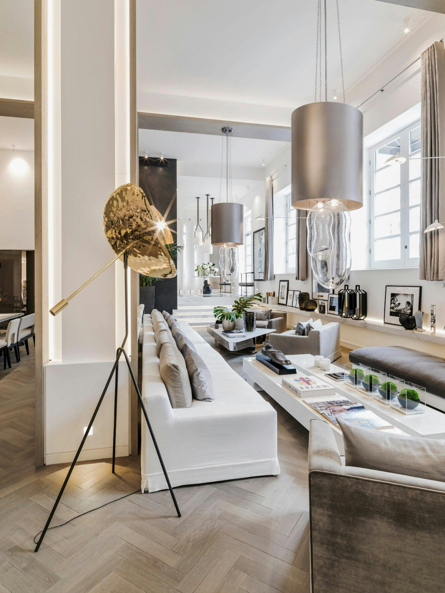
    Image: Kelly Hoppen interior defined by neutral tones, sculptural lighting and layered texture — supplied to WAAR
    Kelly Hoppen: The Art of Quiet Luxury — additional view

    Image: Open-plan residence composed through scale, light and proportion — supplied to WAAR
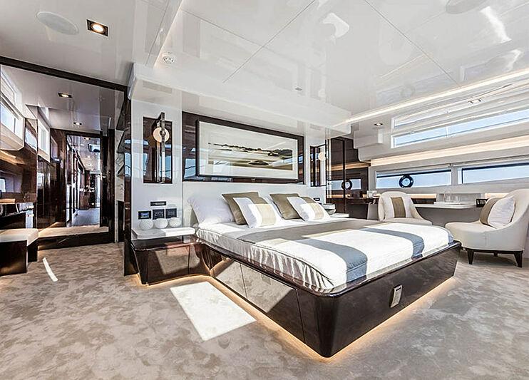
    Image: Yacht suite with a restrained residential character — supplied to WAAR
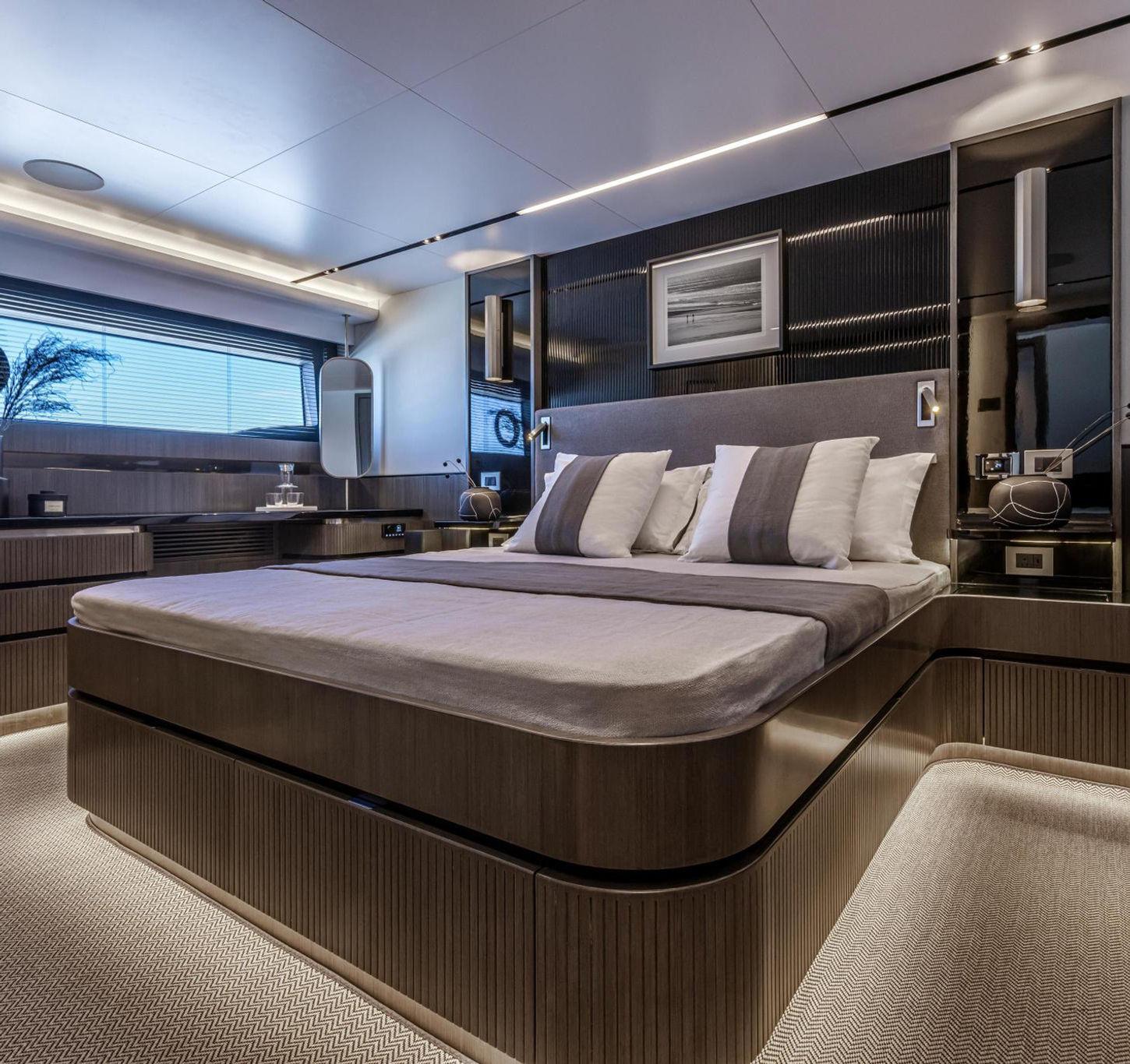
    Image: Yacht suite with a restrained residential character — supplied to WAAR

    Image: Timber, textiles and integrated lighting shape a calm yacht interior — supplied to WAAR

    Image: Timber, textiles and integrated lighting shape a calm yacht interior — supplied to WAAR

    Design Profile

    Kelly Hoppen: The Art of Quiet Luxury

    WAAR Editorial · 2 min read

    Few designers have shaped contemporary luxury interiors as distinctly as Kelly Hoppen. Across residences, hotels, yachts, aviation and product design, she has built a recognisable language from understated elegance, natural materials, neutral tones and exacting proportion.

    Her celebrated East-meets-West philosophy expresses luxury not through excess, but through balance. Ordered geometry meets tactile surfaces; disciplined palettes are softened by timber, stone, textiles and carefully controlled light. The effect is calm without becoming austere and polished without feeling impersonal.

    THE LONDON RESIDENCE: A SIGNATURE HOME

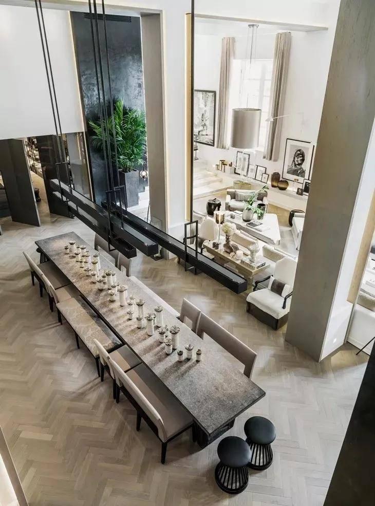
    Among the most revealing expressions of Hoppen’s approach is her own London residence, where the designer’s vocabulary becomes personal. Soaring ceilings and open-plan spaces are composed with oak herringbone flooring, marble, glass, sculptural lighting and furniture chosen for form as much as function.

    The restrained palette allows texture and material to carry the visual weight. Rather than filling the rooms with decoration, Hoppen creates atmosphere through scale, proportion and the measured distribution of light. The home feels contemporary, but not captive to a passing trend.

    Its luxury lies in the confidence to leave space around an object. A long dining table establishes rhythm; a pendant becomes a focal point; framed views connect one room to the next. Every element is given room to register.

    LUXURY AT SEA

    Hoppen’s design vocabulary extends naturally from residences to yachts. The challenge is different: highly engineered marine interiors must accommodate storage, circulation and complex services within a compact envelope. Her response is to make those constraints feel composed rather than conspicuous.

    Rich timber, stone, soft furnishings, metallic details and controlled lighting create spaces closer in character to private homes than conventional vessels. Rounded corners and continuous lines ease movement, while tonal continuity makes cabins and shared rooms feel more expansive.

    The same discipline found in her residential work is present at sea. Technology is integrated, joinery is precise and visual noise is reduced, allowing comfort and craftsmanship to define the experience.

    A LANGUAGE OF RESTRAINT

    Across residential and yacht projects, Hoppen demonstrates that contemporary luxury does not need to announce itself loudly. Her interiors rely on texture, craftsmanship, proportion and atmosphere, creating spaces that are sophisticated without becoming ostentatious.

    That influence extends beyond individual commissions into furniture, home collections and international collaborations. The reach of the work has helped establish neutral, layered interiors as one of the defining languages of contemporary luxury — though in Hoppen’s strongest rooms, neutrality is never an absence of character. It is a framework for detail.

    Her work is ultimately about balance: between East and West, warmth and minimalism, functionality and beauty. For WAAR, it offers an enduring lesson in luxury design: the most memorable spaces are not necessarily those that demand attention, but those that reward it.
    The Return of Patina: Ando, Concrete and the Surface That Records Time

    Photo: Church of the Light, Ibaraki (Tadao Ando, 1989) — Wikimedia Commons

    Material Culture

    The Return of Patina: Ando, Concrete and the Surface That Records Time

    By the WAAR Interiors Desk · 7 min read

    Ando's Church of the Light, completed in Ibaraki in 1989, is the reference point for a movement now visible across luxury interiors: surfaces that are left as they were made. The concrete is the structure and the finish; the formwork tie-holes are the only pattern.

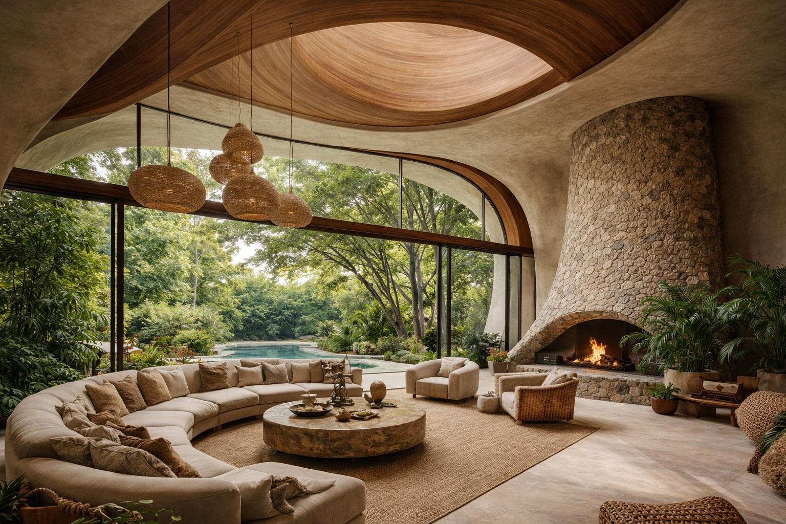
    That thinking has returned in domestic work through unlacquered brass, lime plaster, oiled oak and hand-thrown ceramics — materials specified not to resist time but to record it. Maintenance becomes authorship rather than failure.

    There is an environmental argument too. Lime, clay and solid timber carry a fraction of the embodied carbon of the composite panels they displace, and surfaces that age well are replaced far less often.

    After Open-Plan: What Mies Got Right and What the Farnsworth House Cost

    Photo: Farnsworth House interior, Plano, Illinois (Mies van der Rohe, 1951) — Wikimedia Commons

    Space & Behaviour

    After Open-Plan: What Mies Got Right and What the Farnsworth House Cost

    By the WAAR Interiors Desk · 8 min read

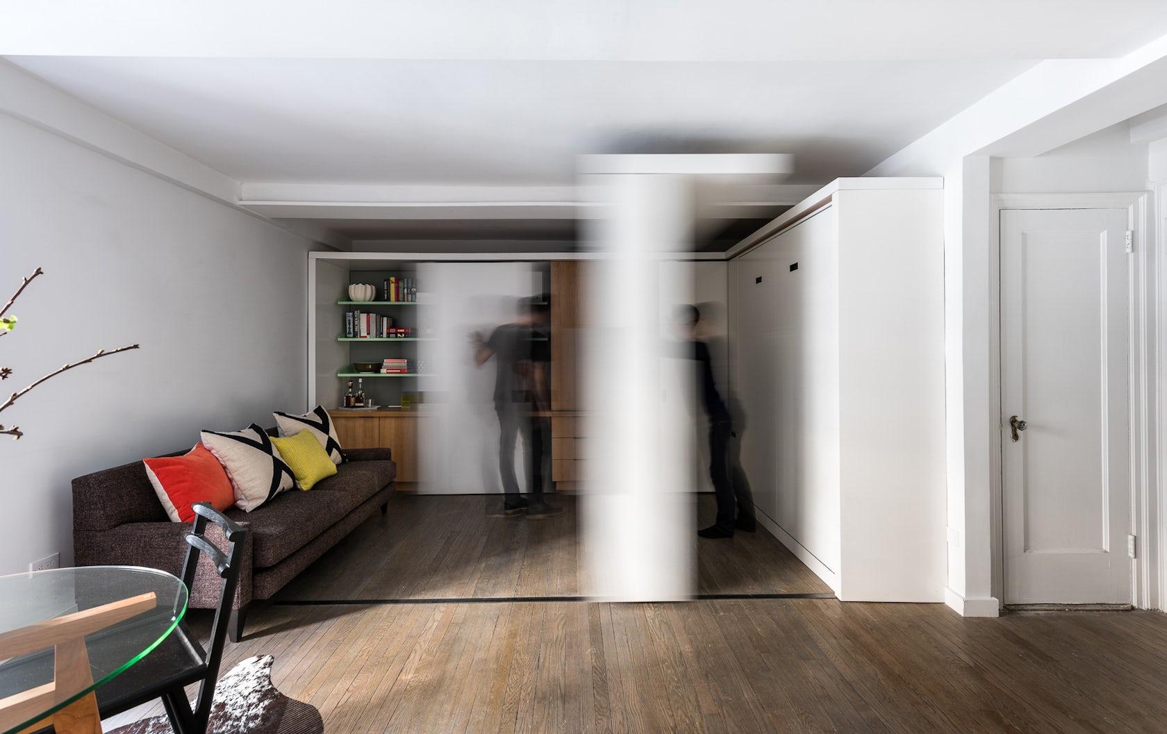
    Mies completed the Farnsworth House in 1951 as a single glazed volume organised around a central service core. Edith Farnsworth sued him, and her complaints — heat, glare, no privacy, nowhere to be alone — are the complaints levelled at open-plan living ever since.

    The contemporary answer is not the cellular Victorian plan but broken-plan: half-height joinery, pocket doors, level changes and glazed screens that divide space perceptually while keeping daylight and sightlines intact.

    Acoustics now decide whether these plans work. Designers specify reverberation targets the way they once specified lux levels, using felt, bouclé, slatted timber and heavy curtains as instruments of comfort rather than decoration.

    Beyond the Beige Consensus: Soane's Museum as a Lesson in Structural Colour

    Photo: Sir John Soane's Museum, London — Wikimedia Commons

    Colour & Light

    Beyond the Beige Consensus: Soane's Museum as a Lesson in Structural Colour

    By the WAAR Interiors Desk · 6 min read

    Soane's house at 13 Lincoln's Inn Fields, left to the nation in 1837 on the condition that it never be altered, uses colour and toplight structurally: Pompeian red in the Breakfast Room, yellow-tinted glass, mirrors set to multiply a shallow London plan into apparent depth.

    That is the argument now displacing the greige interior — a palette chosen for resale rather than for living. Colour drenching, in which walls, joinery and trim take a single deep tone, lets light rather than contrast define a room's edges.

    The most rigorous practitioners draw the palette from the site: the stone of the region, the latitude of the light, the planting beyond the glass. Colour stops being taste and becomes a contextual argument.

    The Invisible House: Can Automated Interiors Ever Be Elegant?

    Photo: Farnsworth House service core, Plano, Illinois — Wikimedia Commons

    Technology

    The Invisible House: Can Automated Interiors Ever Be Elegant?

    By the WAAR Interiors Desk · 9 min read

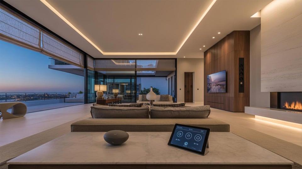
    Every smart-home showroom promises disappearance and delivers keypads. Automation demands interfaces, and interfaces demand the wall space interior designers have spent a century clearing.

    The better answer is sensing rather than switching. Occupancy, daylight and circadian logic can drive most of a house's lighting and climate, leaving one discreet keypad per room as an override rather than the primary control.

    The unresolved problem is obsolescence: a plaster ceiling lasts eighty years, a control protocol perhaps eight. Serious specifiers design for replaceability — conduit, accessible ceiling zones, standards-based hardware — so the technology can be retired without demolishing the room.

    Stay Informed

    The WAAR Weekly

    Exclusive insights on global architecture, landmark developments, and the investment opportunities shaping our cities. Delivered every Thursday.

    Join thousands of industry readers via the WAAR Weekly.